Mend
Recovery can be difficult. Staying motivated shouldn’t be
Duration
9 months
My Role
Lead Engineer
Team
2 UI designers, 1 UX reseacher, 2 developers, 1 product manager
Overview
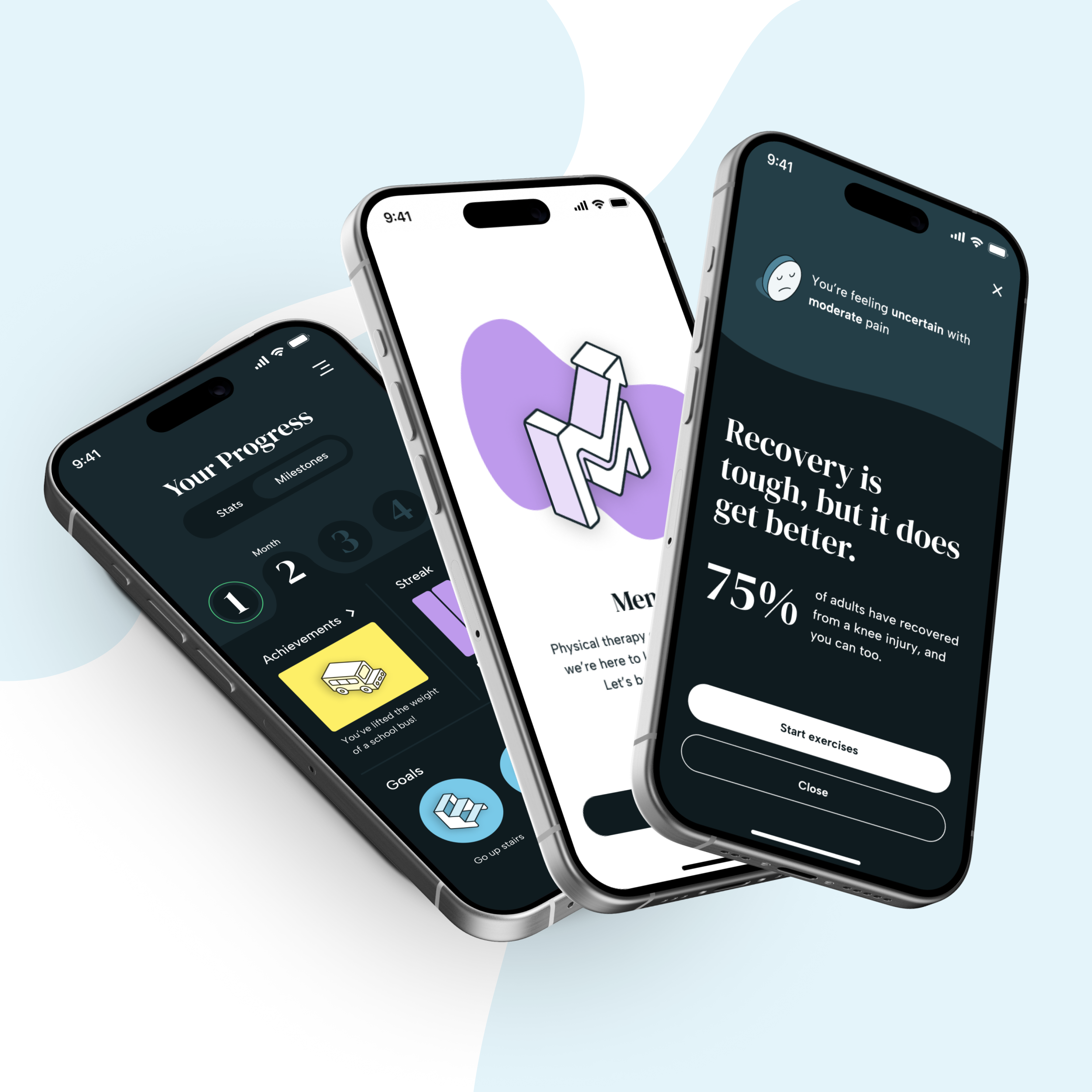
Mend is a physical therapy web app that helps patients stay engaged in their recovery by making the experience feel more personal and emotionally motivating. The app offers daily guided exercises, tone-customized encouragement, and visual progress tracking based on real data from their physical therapists. I served as the lead developer on a six-person interdisciplinary team, where I worked closely with design, set up our frontend architecture, built the component system, and implemented the core user flows. The project combined thoughtful research, tight cross-functional collaboration, and a strong focus on user care, all wrapped into a real, functioning product.
The Challenge
When we spoke to patients, it became clear that the emotional side of recovery often gets ignored. Many people described feeling unsure about their progress or disconnected from their care plans once they left the clinic. While physical therapists were tracking detailed recovery metrics, patients rarely saw that information. And when it came to doing exercises at home, most people were sent off with a paper packet or a sterile white-labeled app that didn’t feel personal or motivating. We saw an opportunity to build something different. Our goal was to create a tool that helped patients feel supported even when they weren’t face-to-face with their therapist. That meant showing real progress, offering encouragement, and building in small moments of motivation that could help users stick with their recovery on hard days.
The Solution
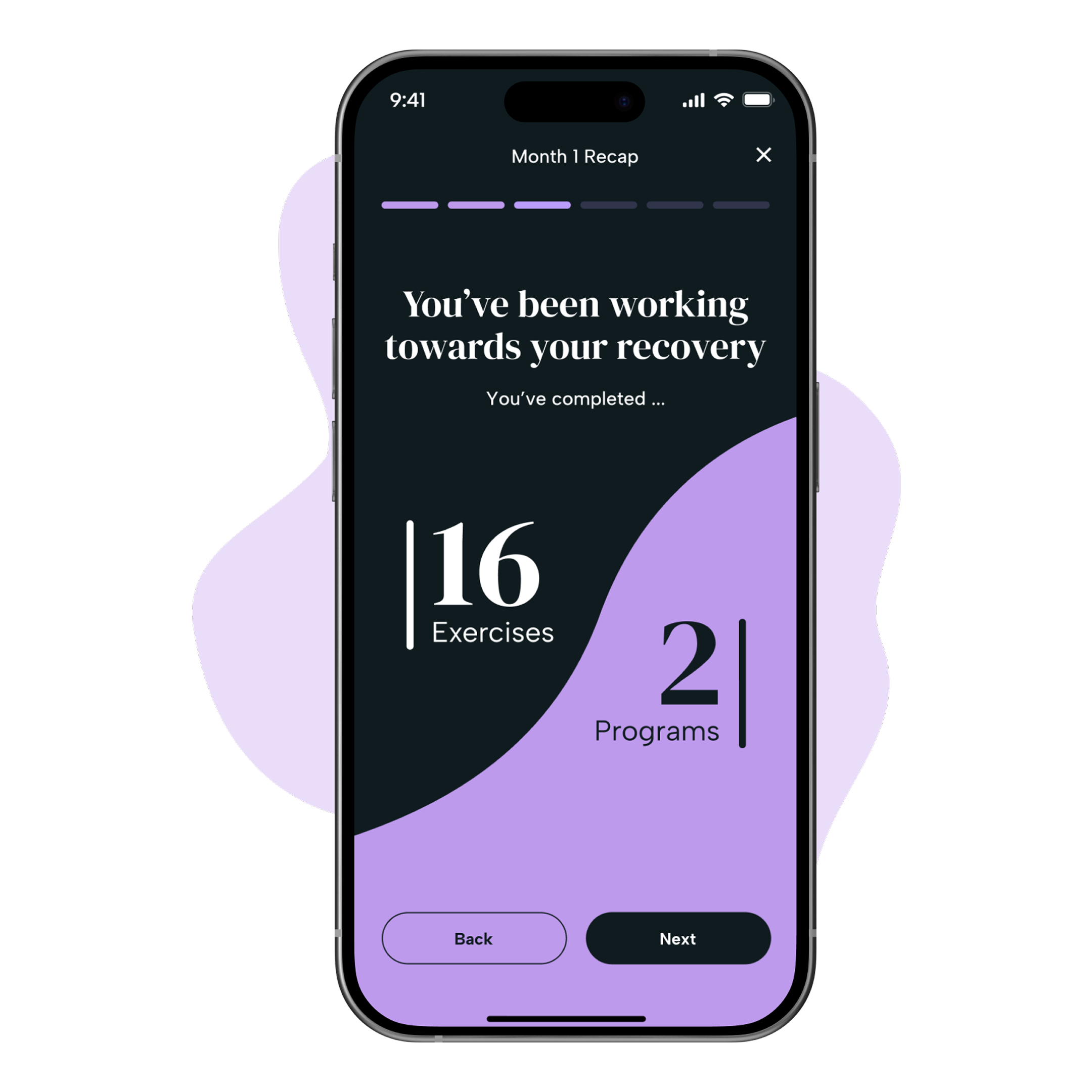
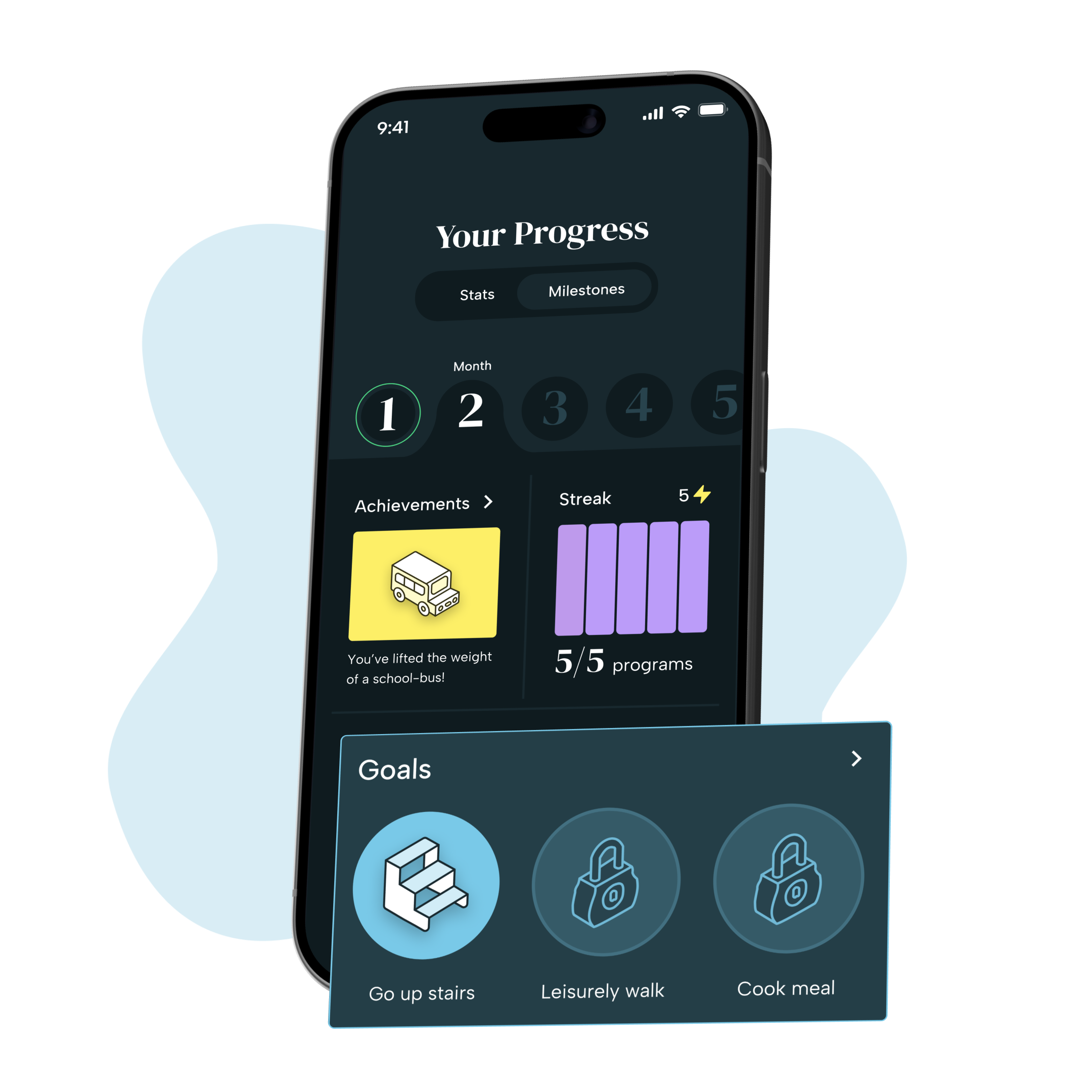
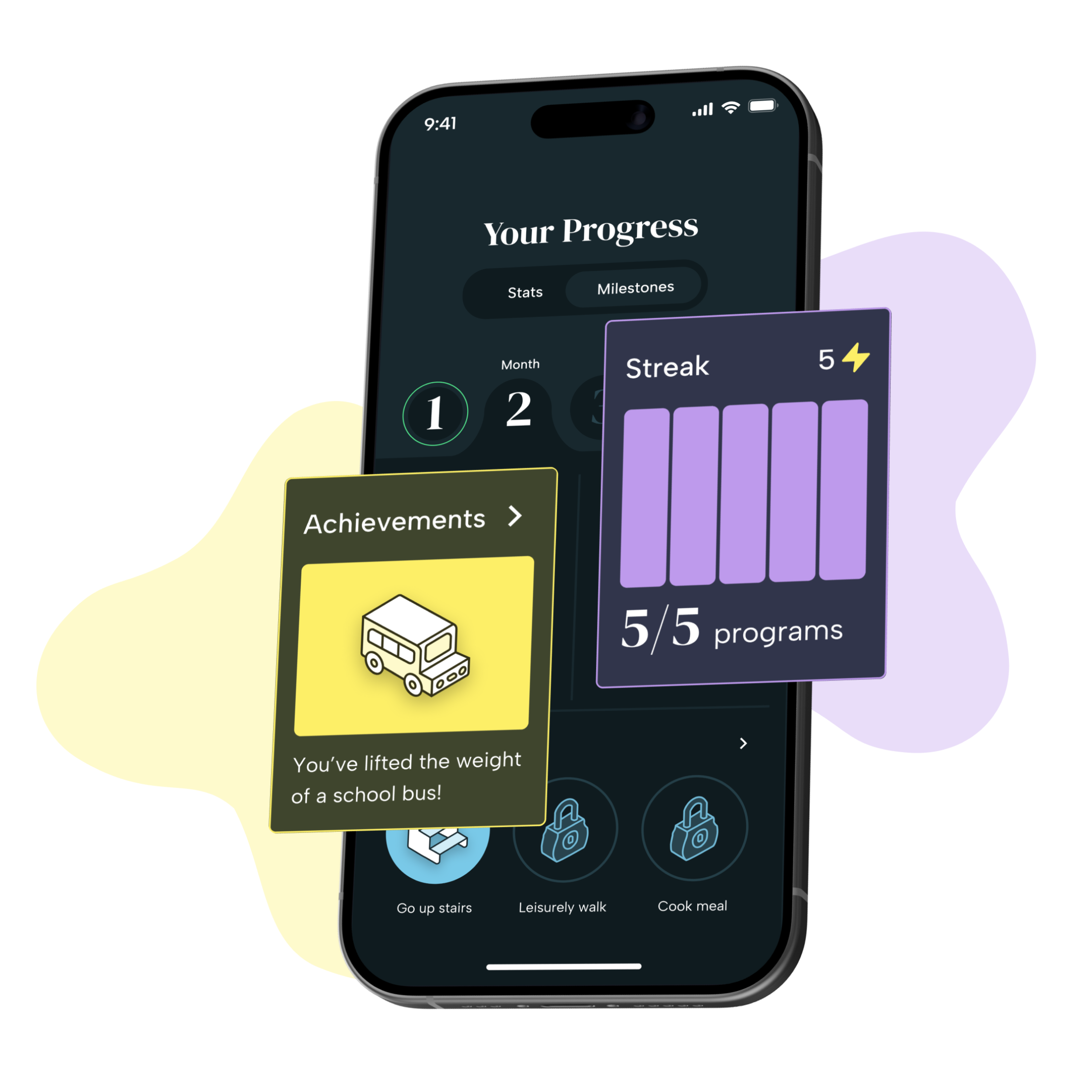
Mend offers patients a full at-home recovery experience through daily check-ins, guided exercises, and visual feedback. It lets users track their pain and mood, receive motivational prompts based on their preferences, and celebrate their progress through streaks, achievements, and therapist-managed goals. My focus as lead developer was to bring these features to life with care and clarity, while building an underlying system that could scale. Every part of the product was designed to help users feel seen and encouraged, especially during moments that might otherwise feel isolating.
The Process
Close Collaboration with Design
From the beginning, I worked side by side with our design lead to make sure our ideas were grounded in both user feedback and technical feasibility. We met weekly to discuss new features, walk through usability feedback, and find solutions to issues before they became blockers. When users flagged confusion around certain interactions (like the original “hold to complete” feature) we re-evaluated the design together, explored alternatives, and updated the implementation based on what tested best. These conversations helped shape a product that felt cohesive and intentional across the board.
Building the Design System
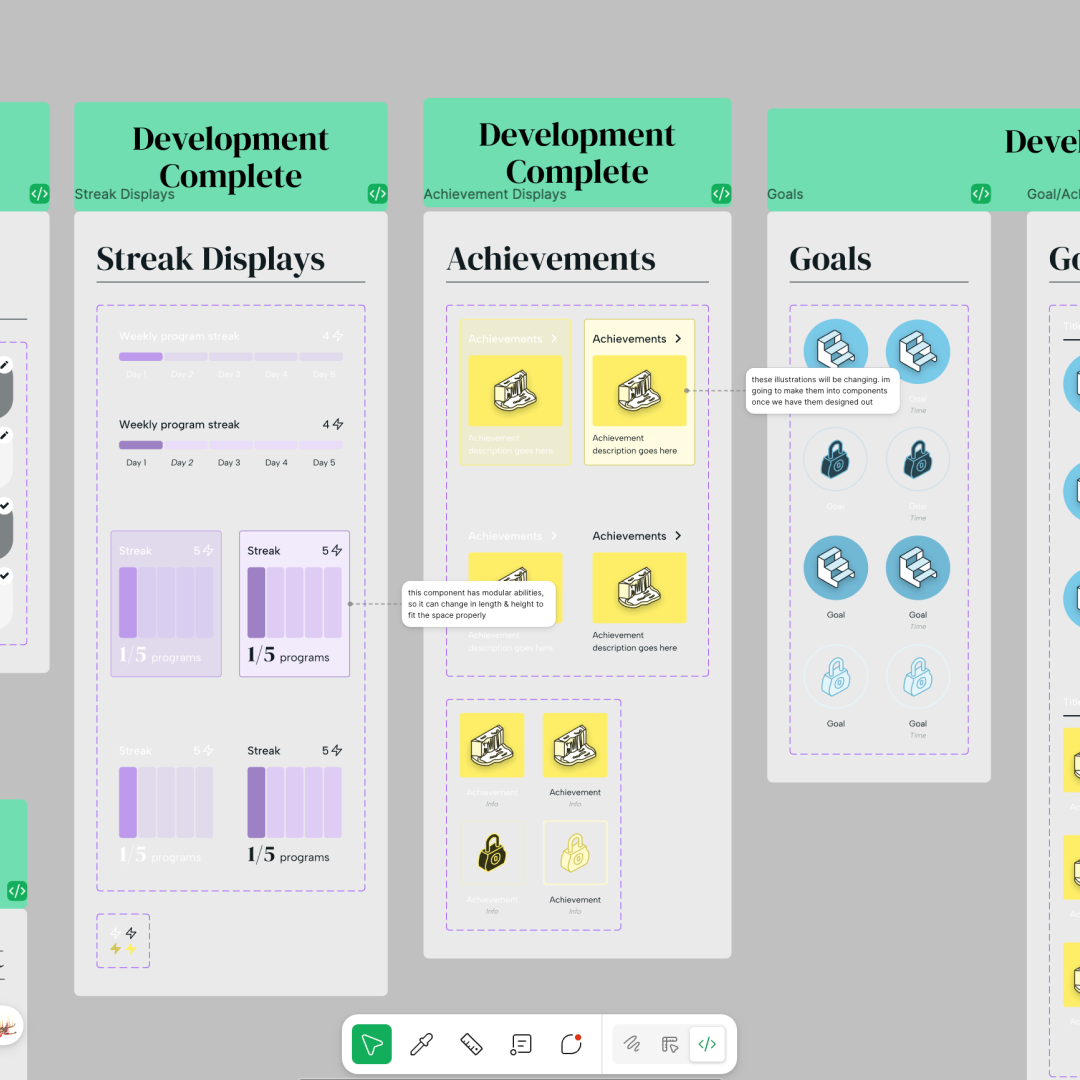
One of my first priorities was creating a design system that reflected the structure and consistency of our visual language. I built a responsive component library in Svelte that matched our Figma styles, allowing designers to see exactly how components rendered in the browser. This system helped us maintain alignment as new screens were added and made it easier to spot discrepancies across breakpoints. It also sped up implementation, since I could reuse flexible components across flows without sacrificing consistency or polish.
Development Workflow and Engineering Practices
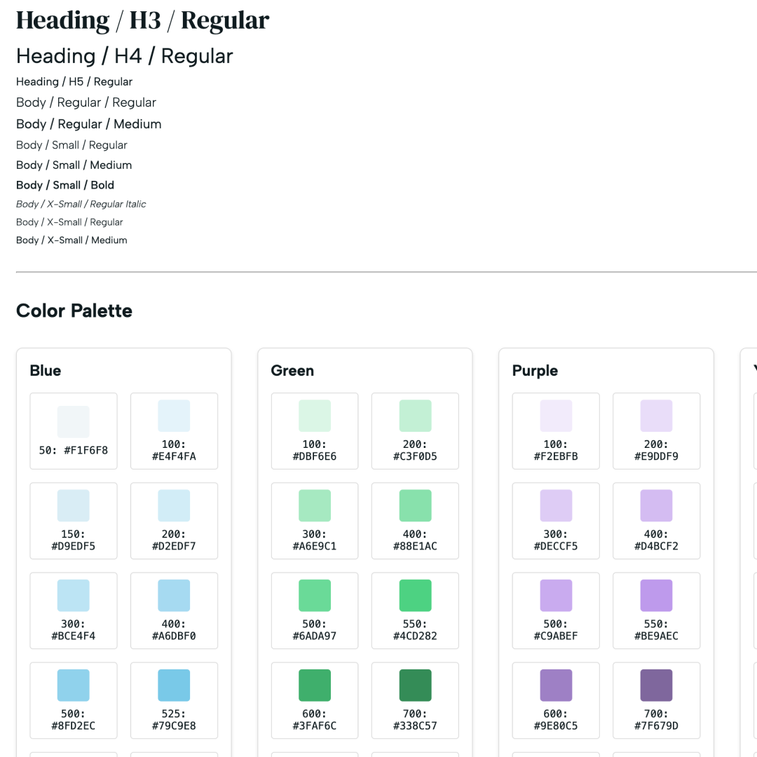
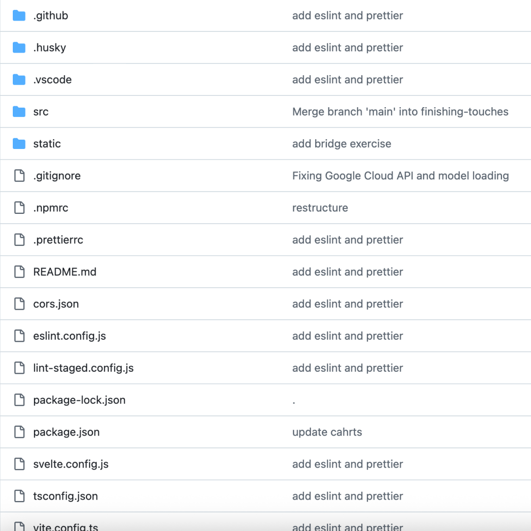
Because our team included multiple developers, I took the lead on setting up our engineering workflows. I structured our codebase with modular components, established version control best practices using GitHub, and introduced ESLint to keep our code clean and maintainable. I also helped scope and assign features, reviewed pull requests, and supported the other developers throughout the project. By setting up preview deployments with Vercel, we were able to test features in production-like environments and avoid last-minute surprises before merging.
3D Guided Exercises
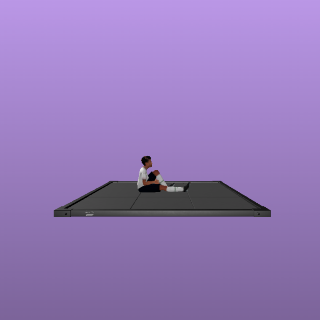
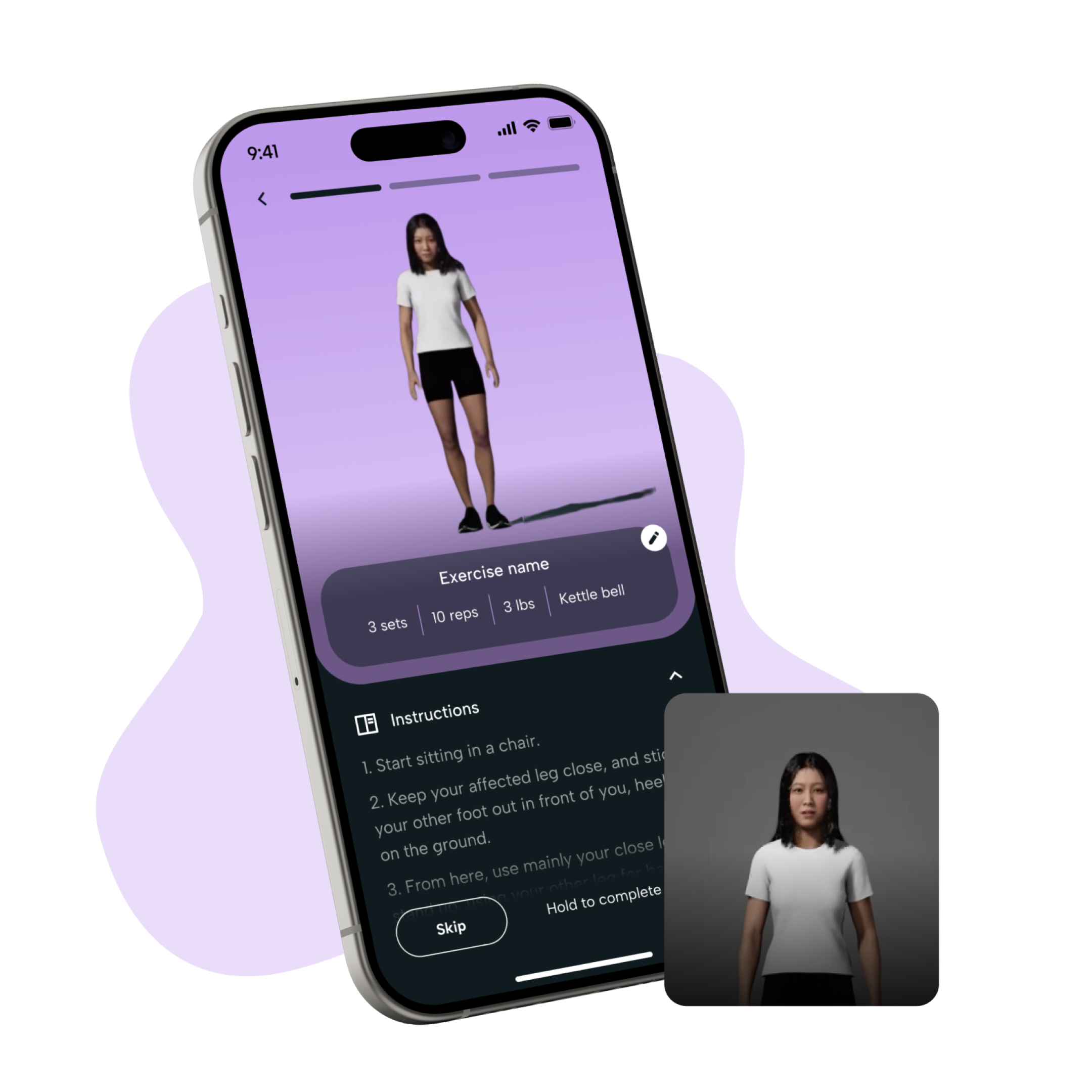
One of the most impactful parts of Mend is the exercise flow. I implemented interactive 3D models that demonstrated each movement clearly, giving users confidence that they were doing their exercises correctly. This was especially important for people recovering from knee injuries, who might otherwise hesitate without in-person guidance. I optimized the models for performance and made sure the flows were accessible across screen sizes and devices.
Mood and Pain Check-Ins
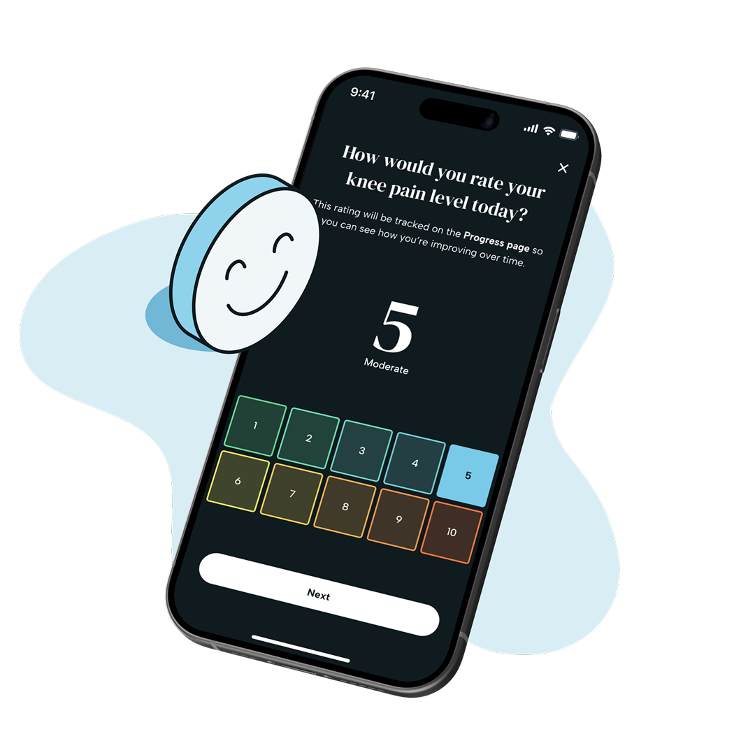
Each day, users are prompted to log how they're feeling physically and emotionally. I built out the check-in flow so it felt fast, lightweight, and supportive—more like a conversation than a form. These inputs are used to customize the tone of encouragement and inform the user’s progress charts, making the experience feel more responsive to their lived reality.
Motivation Through Tone and Feedback
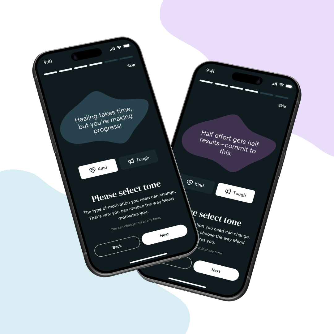
Users can choose between a “Tough” or “Kind” motivational style, depending on what type of encouragement works best for them. I implemented the logic for these tone-based experiences and worked with design to make sure each message landed with the right feel. It was a small detail, but it added a layer of personalization that testers really responded to. I also built the backend flows for unlocking achievements and tracking streaks, which helped users stay accountable without feeling pressured.
Visualizing Progress with D3
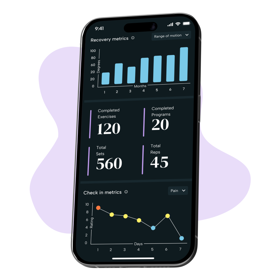
To help users see their recovery over time, I used D3.js to create dynamic graphs that reflected therapist-entered metrics. These visualizations were designed to be clear and easy to understand, even for users who didn’t have a medical background. I also added info icons and onboarding explanations to help users understand where the data was coming from and how to interpret their progress.
Results & Impact
Usability Testing
Users found each feature to be motivating
User Modivation
Users felt an increase in overall motivation levels
Visual Design
Interested in Working Together?
I'm always excited to take on new challenges and create meaningful digital experiences. Let's discuss your next project.